November 9, 2026
How to Format LinkedIn Posts Without Losing Readability
Learn how to format LinkedIn posts with proper spacing, bullet points, stylish text, and emojis while keeping your content clear and readable.
How to Format LinkedIn Posts Without Losing Readability
LinkedIn posts help professionals share ideas, experiences, and updates with their network. However, the way content is presented can affect how people read and respond to it. Poorly formatted posts with long paragraphs and cluttered text can make readers lose interest.
Good formatting improves readability, makes important information easier to notice, and gives posts a cleaner appearance. It also helps maintain a professional image and makes the overall message easier for readers to follow.
Use Short Paragraphs and Proper Line Breaks
Avoid writing your entire LinkedIn post in one large paragraph. Long blocks of text can be difficult to read, especially on mobile screens.
Instead, divide your content into short paragraphs and use line breaks to separate different ideas.
Here are a few tips:
Keep each paragraph around 1–3 sentences.
Leave a blank line between separate paragraphs.
Keep related sentences together.
Start a new paragraph when moving to another point.
Avoid adding line breaks after every sentence, as this can make the post look scattered.
This simple approach makes your content easier to scan and helps readers follow your message.
Use Bullet Points to Organise Information
Bullet points are useful when you want to share multiple tips, ideas, or steps in a LinkedIn post. They break information into smaller sections, making it easier for readers to find specific details.
For example, if you are sharing tips for improving productivity, you can present them like this:
Set clear goals for each day.
Avoid unnecessary distractions.
Take short breaks between tasks.
Review your progress regularly.
You can also use numbered lists when sharing instructions or steps that readers should follow in order.
However, avoid putting every sentence into a bullet point. Use them only when they make your information easier to understand.
Highlight Important Words With Stylish Text
You can use different text styles to draw attention to important words, headings, and short phrases in your LinkedIn posts. For example, bold text can highlight a key takeaway, while cursive text can give a phrase a different appearance.
LinkedIn does not provide built-in font formatting options for regular posts. However, you can use LinkedIn Font Generator to create different text styles.
Just follow these steps:
Open the LinkedIn Font Generator.
Enter or paste your regular text into the input box.
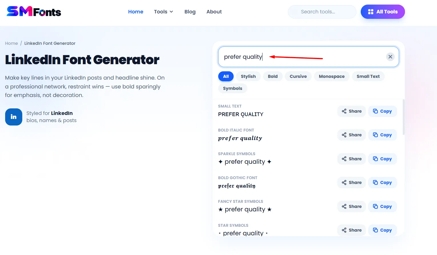
Browse the available font styles.
Copy the style that suits your post.
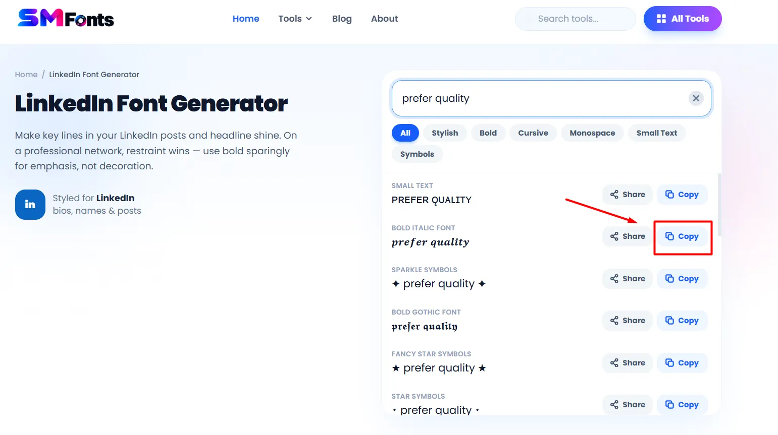
Copy the converted text and paste it into your LinkedIn post.
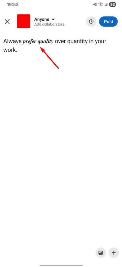
You can use different styles, such as bold text, italic text, cursive text, and other decorative fonts.
However, use these styles selectively. Highlighting a few important words is usually enough. If you convert entire paragraphs into decorative text, your post may become harder to read.
Use Emojis Without Overloading Your Post
Emojis can add visual breaks to your LinkedIn posts and help highlight different points. They can also make certain types of content easier to scan.
For example, you can use a checkmark before a list of completed tasks or a lightbulb emoji when sharing an idea.
Keep these points in mind:
Use relevant emojis that match your content.
Place them at the beginning of bullet points or short sections.
Avoid adding multiple emojis after every sentence.
Use a consistent style throughout the post.
Do not replace important words with emojis.
Remember that LinkedIn is a professional platform. Your emojis should support your message rather than distract readers from it.
Choose a Readable Post Structure
A well-organised LinkedIn post should have a clear beginning, middle, and ending. This helps readers understand your message without having to go through unnecessary details.
You can follow this simple structure:
Opening: Start with an interesting question, statement, or experience to introduce your topic.
Main content: Share your information using short paragraphs, bullet points, or examples.
Key takeaway: Highlight the main lesson or idea you want readers to remember.
Ending: Finish with a question or a simple call to action if you want to encourage discussion.
You do not need to use every element in every post. Choose a structure that suits the type of content you are sharing.
Avoid Excessive Formatting and Decorative Characters
Adding different text styles and symbols can make your LinkedIn post look interesting. However, using too many decorative elements can affect its readability.
Here are some common formatting mistakes to avoid:
Using multiple font styles throughout the same paragraph.
Writing entire posts in bold or decorative Unicode text.
Adding unnecessary symbols between every sentence.
Using excessive capital letters for emphasis.
Adding too many emojis and special characters.
Mixing different formatting styles without a clear reason.
Keep your formatting consistent and use decorative elements only when they serve a purpose. Also, remember that some Unicode characters may not display correctly on every device or screen reader.
Final Words
Formatting your LinkedIn posts does not have to be complicated. Use short paragraphs, proper line breaks, and bullet points to organise your content. You can also highlight important phrases with stylish text and add a few relevant emojis. The main goal is to make your posts easy to read while keeping their appearance clean and professional.